These are my reviews on two projects I found most interesting in the class.
Theme
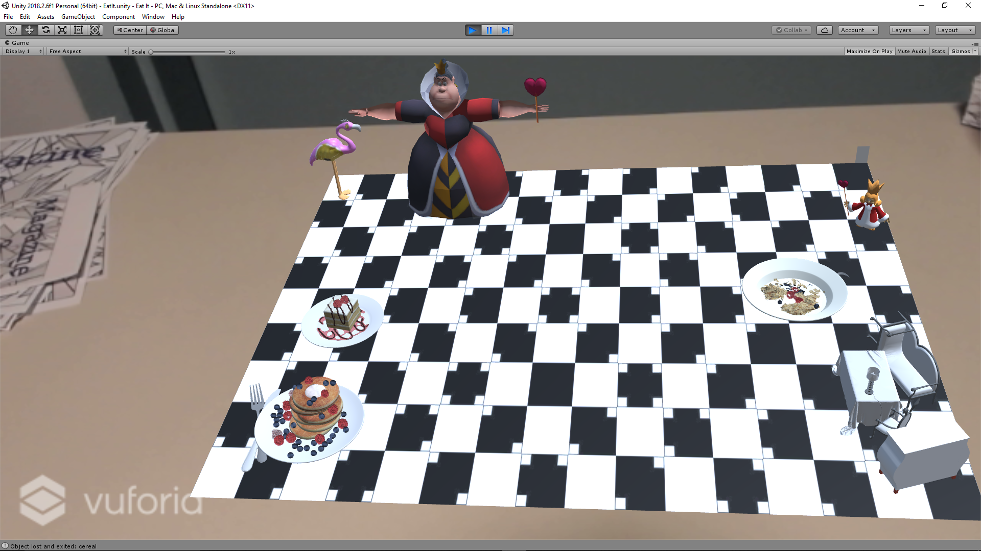
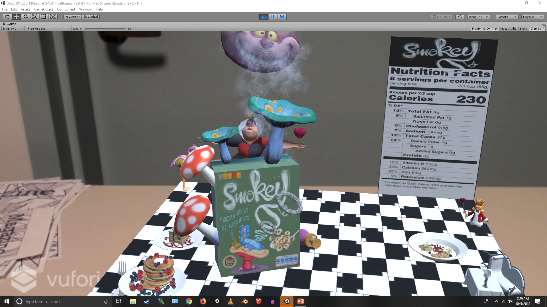
I found Mantovani’s project really interesting. It had a “Alice in Wonderland” themed Augmented Reality breakfast. The whole scene was neat and didn’t have any extra models to crowd or ruin the theme and experience. Also each item had a bit of a back story that give a more complete feel to the whole setup. That being said the models were very cleverly chosen (or made). More about it is written below.
Design and Animation
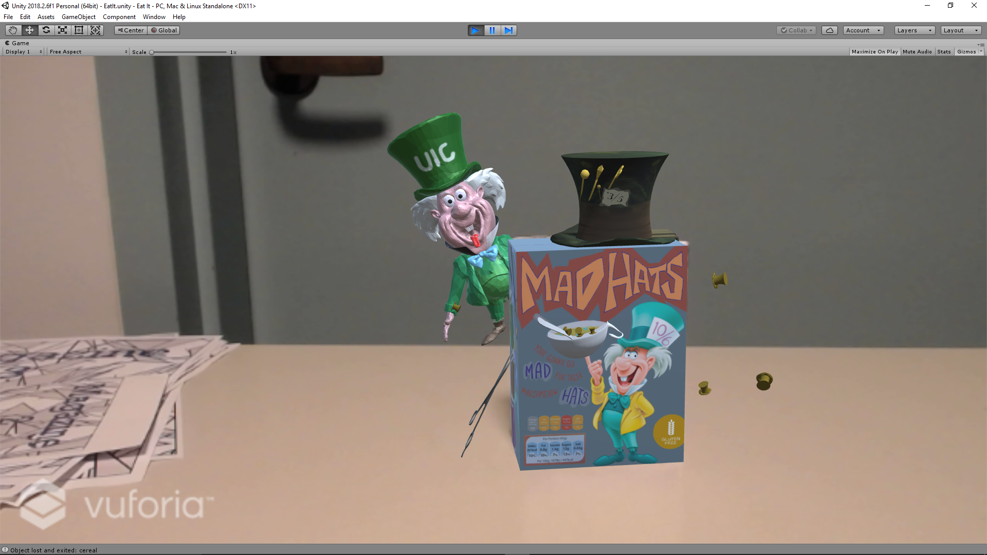
Apart from the models that were taken online, the models made from scratch were very artistic and some characters like Mad Hatter really resembled the character in the cartoon. The Mad Hats cereal box also had hats flying from the back to the front.
The placemat had a kitchen like tiling to simulate that it is a place for food and models of pancakes, toaster, flamingo, and other models to have a happy breakfast scene.
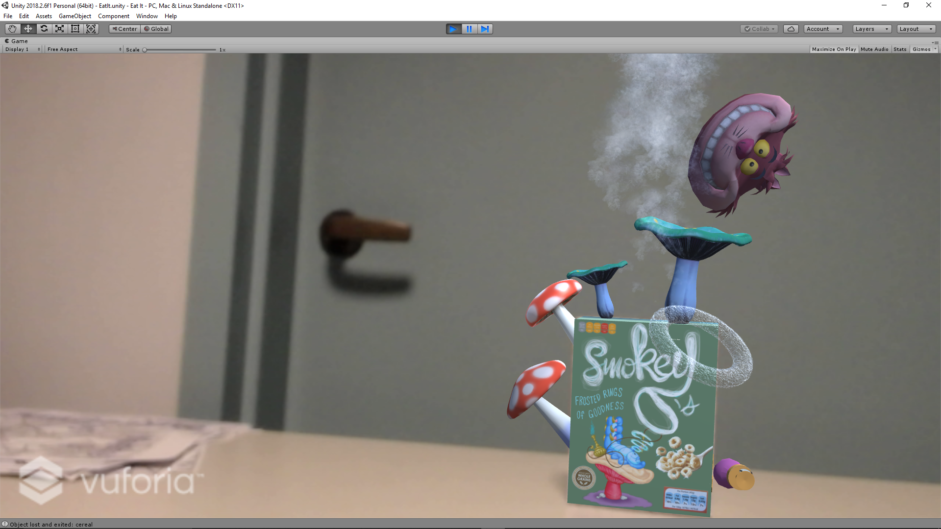
My favorite was the Smokey Os cereal box which had a really good design. There was Smokey’s face that kept bouncing off the mushroom on the top and there was also smoke coming off it which was quite realistic. Another really cool model was that of the Aced Tea. Which had cards popping out of the mouth of the Door handle and the animation of the spear rotating in a constant clockwise and anti-clockwise fashion. The custom designed Rabbit Hole was carefully designed too and had a rabbit hole which also had animations of rabbit falling into it.
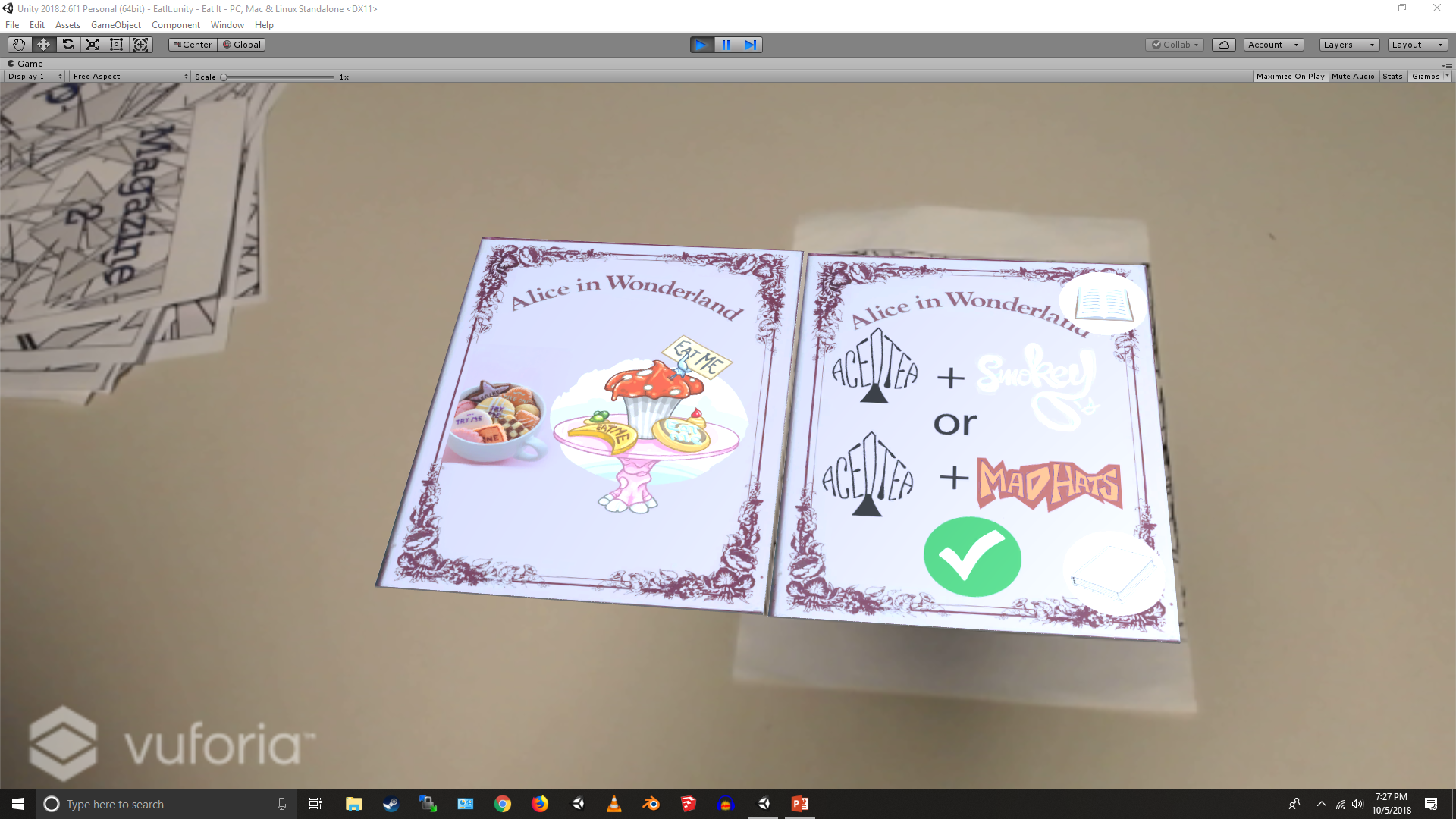
Another model was the Alice in wonderland Cookbook magazine that had recipes of which objects on placing on the place mat together will give a positive reaction and which object will not. The magazines also had a real life magazine feel by the pages flipping back and forth. The interesting part about this book lies in the design to simulate a magical book kind of feel.
Audio
The audio given to each of the scenes were carefully thought out to not give the user a bad experience except the sound effects for the ingredients which I think could have been different. The sound effects were limited and nice to use. The Smokey Os cereal box had a realistic smoking sound effect. The placemat had two sound effects one for bringing up the ingredients and a whistle kind of sound to indicate of the Kettle whistling and the Mad Hats cereal box is that of crunching cereals. All these sound effects are aptly given to have a real life feel for the models.
Interaction
Since the project shouldn’t feel static and it needs to keep the user engaged, some forms of interactions were included to make the user feel in control. The way the models fight upon close proximity is really fun to watch. This could have been taken further but it was all that could have been accomplished in the given time. On bringing the “Mad Hats” cereal box close to the “Aced Tea”, the former starts arguing that his cereals are better than the latter’s drink and the latter getting angry starts animating the drink me sign above it. Something similar happens on bringing the Mad Hats cereal box close to Smokey’s cereal box. Similar to how rabbits jump into the rabbit hole on feeling threatened, the objects in the Rabbit hole box jump into the hole on bringing the Mad Hats box near it.
On placing the items on the place mat we get the ingredients of the box displayed on the mat. As per the instructions in the magazine on bringing two items on the placemat we get a smiley emoticon if the items are compatible and a sad smiley if they are not. Also to provide an indication as to if the item is healthy.
The whole project is really quite an interactive art and it caught my eye on the first sight. It was all related to a single theme and its very well thought out. It was very creatively done and someday I can see fans of “Alice in Wonderland“, having a similar themed breakfast. Kudos to Mantovani and great work!
Click
here to know more about the project.
From the moment I caught a glimpse of Adhokshith’s project, I was impressed by various factors. The first attribute that caught my attention was the how aesthetic the entire project looked. It was easy to see the amount of effort and time that went into making everything look as comfortable in it’s surroundings. I found this part of the project impressive because it is hard to find a set of assets which all collectively go together. Therefore, the fact that he was able to make everything fit in definitely requires some acknowledgement.
Theme
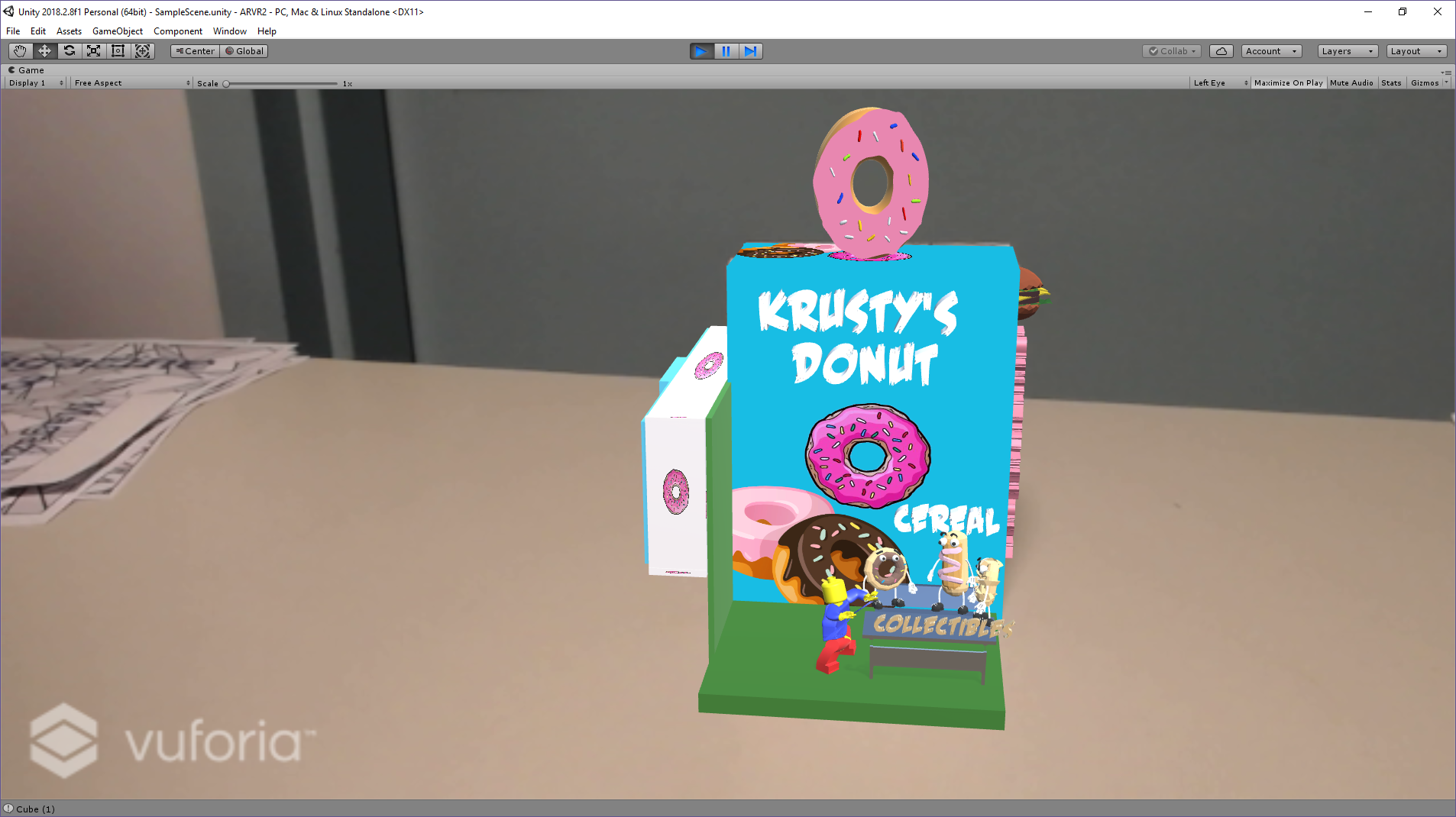
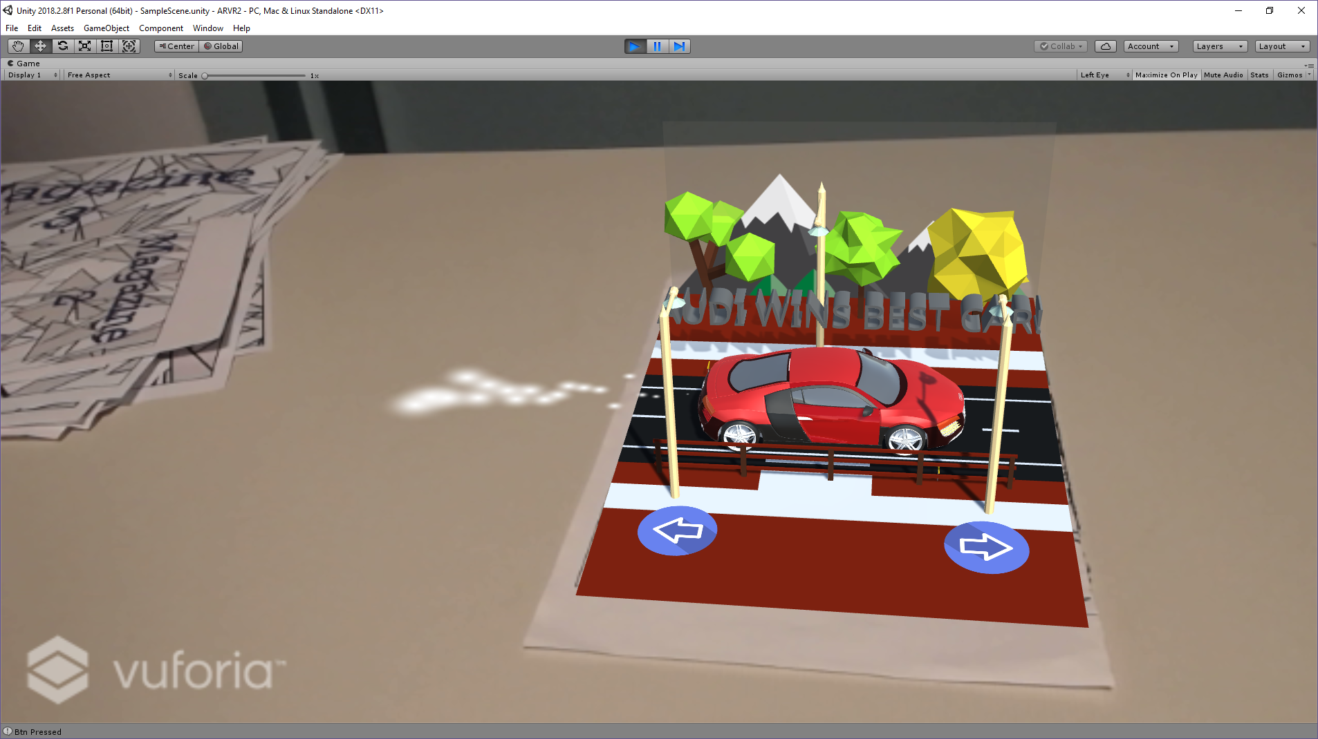
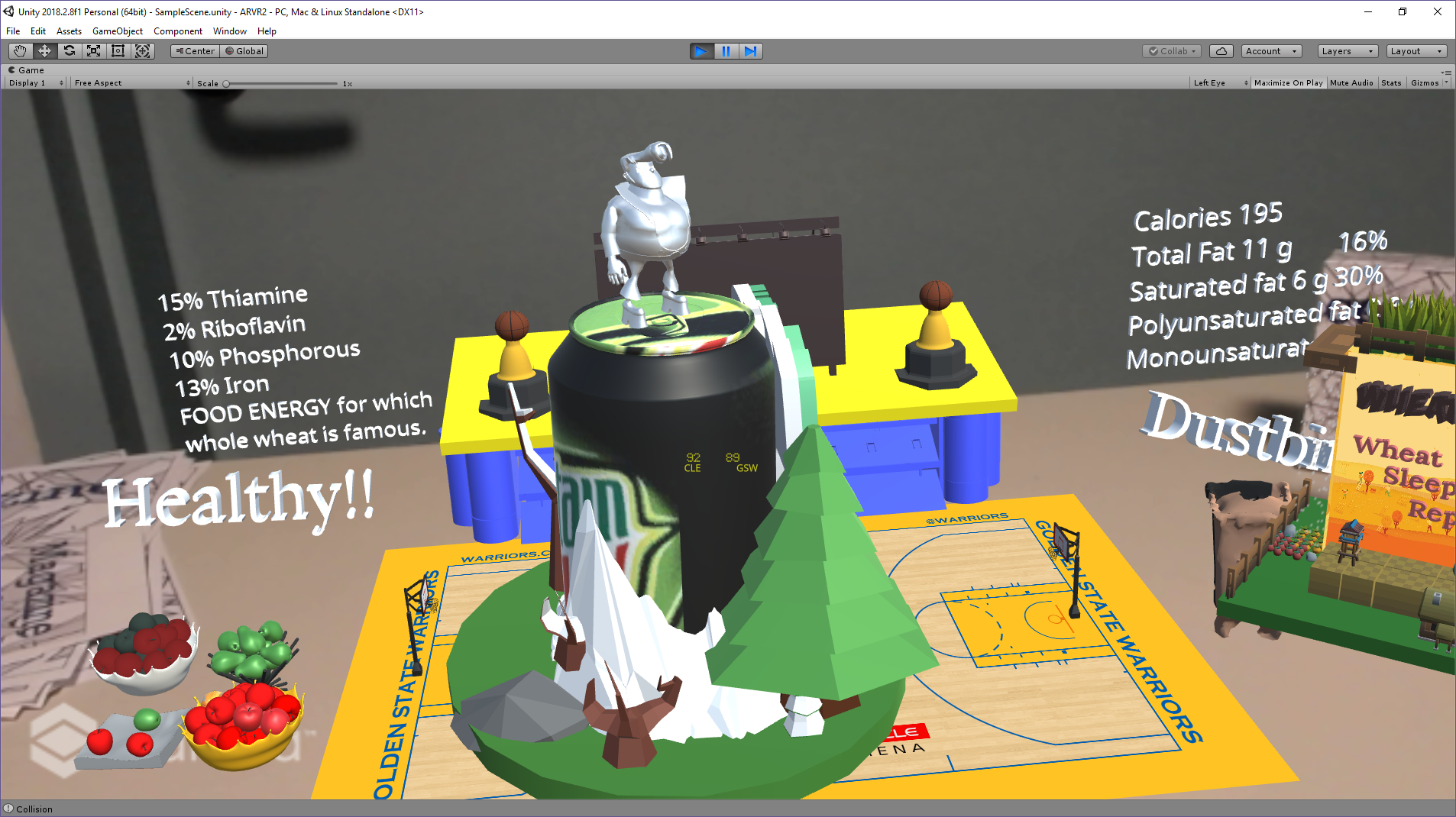
I recognized that the theme for the project was not constricted to anything. Instead of having a theme for the entire set of targets, he incorporated a particular design theme. Most of the objects and the environment made use of low poly assets. The placemat sets up the project to make it look like a basketball court. I think this is because he wanted the environment to be something different from the usual breakfast setting. The whole objective of augmented reality is to make sure that the other worldly becomes a part of your world. This placemat was his way of representing something out of the ordinary.
Design and Animation
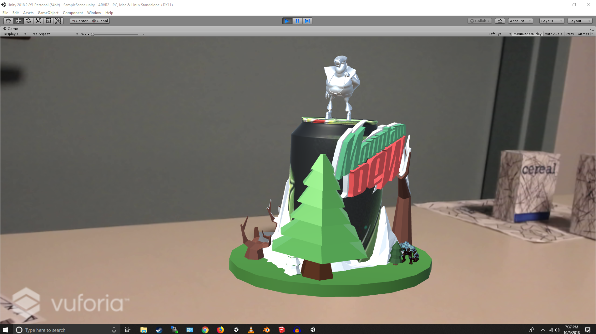
From a design perspective, I really enjoyed each of the models. They were all pleasing to the eyes and there was nothing that seemed out of place. He made use of a lot of low poly models which I believe gives a nice cartoonish feel to the project. Another advantage of using low poly models is the fact that it is easier to render since all the objects are made of low level polygons. I was also able to distinguish the models that were designed by him from the models that were imported from the asset store. I was really impressed by the modelling of the trophy and the wolf. The wolf was especially impressive because of it’s irregular shape. It was probably not the best model of a wolf. While the body of the wolf seemed pretty accurate, the face was a bit disfigured. However, I must admit, it was a commendable job considering the complexities of the wolf. Overall, from a design perspective, I really liked the entire project.
From an animation perspective, there were animations for every single object. While some of these seemed a little repetitive, the animations were really good. The mascot’s for the two different cereal boxes had similar dances. The characters that were used for the mascot’s were very apt. The wheat cereal box which stood for the healthy option had a farmer whereas the Krusty’s donut had a yellow faced lego man to represent the Simpsons. One of my favourite animations that were part of his project were the birds flying around the cereal box designed by him. The birds were an added benefit to the beautiful scenery. The mascot for the mountain dew can had a man at the top simulating a drinking motion. Each of the characters for all the objects were luring potential customers. This was a nice way to advertise various products. I really enjoyed all the animations in the project. However, I feel like the mascot for the table mat could have done something other than just walk across the basketball floor.
Audio
There was ample use of audio in the project. However, I do feel like there was a little too much audio. When any object is placed on the placemat, the object’s tagline is played. This is not an ambient sound and seems a bit overdone. I understand what he was going for but I believe that such harsh sounds were not required. When two objects come close to each other, these objects utter their war cry’s. These sounds were very apt as they fit the scene. The wheat cereal utters the mooing of a cow which fits the scene whereas Krusty’s donut lets out Krusty’s signature laugh.
Interaction
From the set of projects that I observed, this was one of the projects which had a lot of interaction. While the interactions were not too complicated, they were clean and apt according to the scene. Firstly, all the objects had the ability to interact with the placemat. When any of the cereal boxes or drink were placed on the mat, firstly, the video on the placemat stops. Then the nutrition information of the cereal or drink is given. Depending on whether it’s healthy or unhealthy, a dustbin or a bowl is displayed accordingly.
Adhokshith also had interaction between different cereal boxes and drink. If two cereal boxes or drink came too close to each other, each of these objects would get equipped for battle. The donut cereal acquires a sharp knife, the mascot of the drink pulls out a sword whereas the wheat cereal pulls out two rakes. When the objects go out of range of each other, they return to their original state without their weapons.
Overall, I really liked the project and the depth that it had. All the interactions provided some feedback to the user instead of just having static objects which area all independent. I admire the work that went into making the designs pleasing to the eyes. The entire project gave me a very lively feel and I liked how there was a bit of everything. One of the standout objects of the project was the magazine. I loved the entire set up of the magazine and the controls for the magazine were extremely smooth. From personal experience, I understood that getting the magazine to work accurately takes time and patience so I was impressed by how well the buttons for the magazine worked.
Click
here to know more about the project.
In conslusion I would like to say that the projects I chose to review are not the only projects I found interesting. It was quite hard picking two projects I liked because there were numerous other projects that are unique in their own way. I loved being part of this project and working along side many talented fellow peers. Cheers!
Click
here to visit the webpage with all the projects.